


Since 2002, Flyer.be offers impressions through a website. E-commerce was not yet so popular when Flyer.be was the first to offer prints through an online platform at unbeatable prices.
Over time the online printing market became a more competitive, flyer.be needed to keep these customers and win others,
My intervention was at the UI and UX level, I had to do studies and research on the target, analysis of the print market and this competitor had to propose, after several testing and prototyping a complete redesign was done at the aesthetic and functional level in order to guarantee the users a delightful experience.
What’s done ?
- Advertisement
- Photography
- Strategy
Process
What is the process?
- Understand
- Research
- Analyze
- Design
- Launch
- Analyze again
Why apply it?
Following this UX process doesn’t just give users an intuitive and pleasurable experience—it poses an opportunity for designers to iterate and improve their designs.
“Good design is about process, not product”
Jared SinclairMentor
Wireframing
Easy Transition
Aliquam ligula lectus, efficitur non pretium quis, elementum quis sapien. Nunc dapibus mi vitae mi placerat eleifend. Cras ullamcorper molestie massa, at suscipit quam rhoncus vel. Suspendisse accumsan id diam.
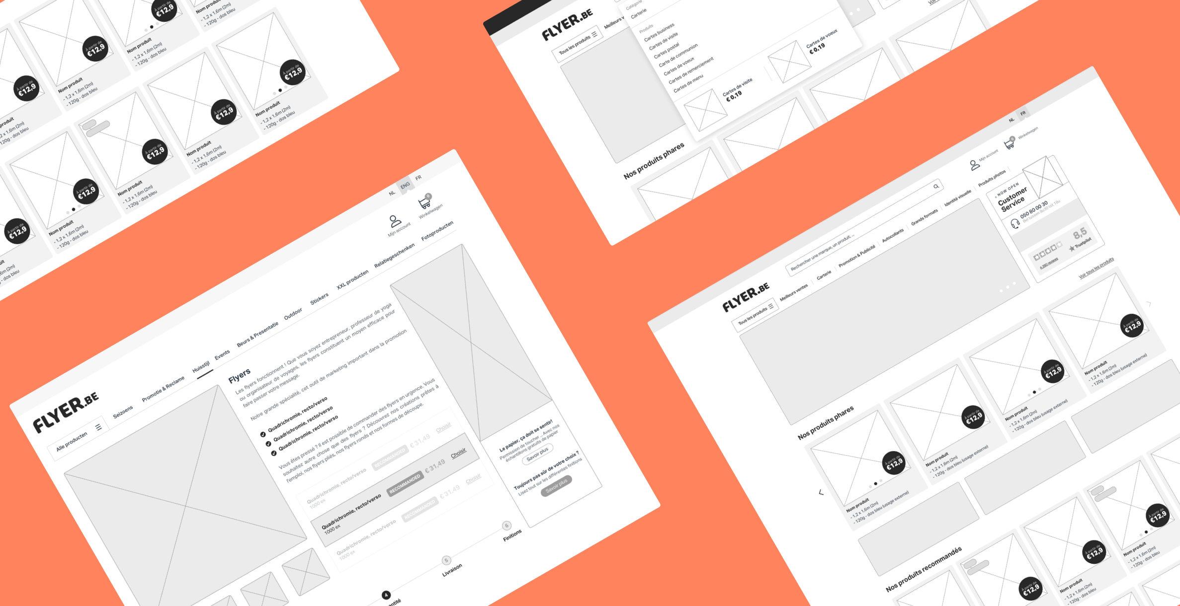
Concept
Easy Transition
My task is to create a design concept, which demonstrates the basic principles of user interaction with the service, depending on same scenarios.

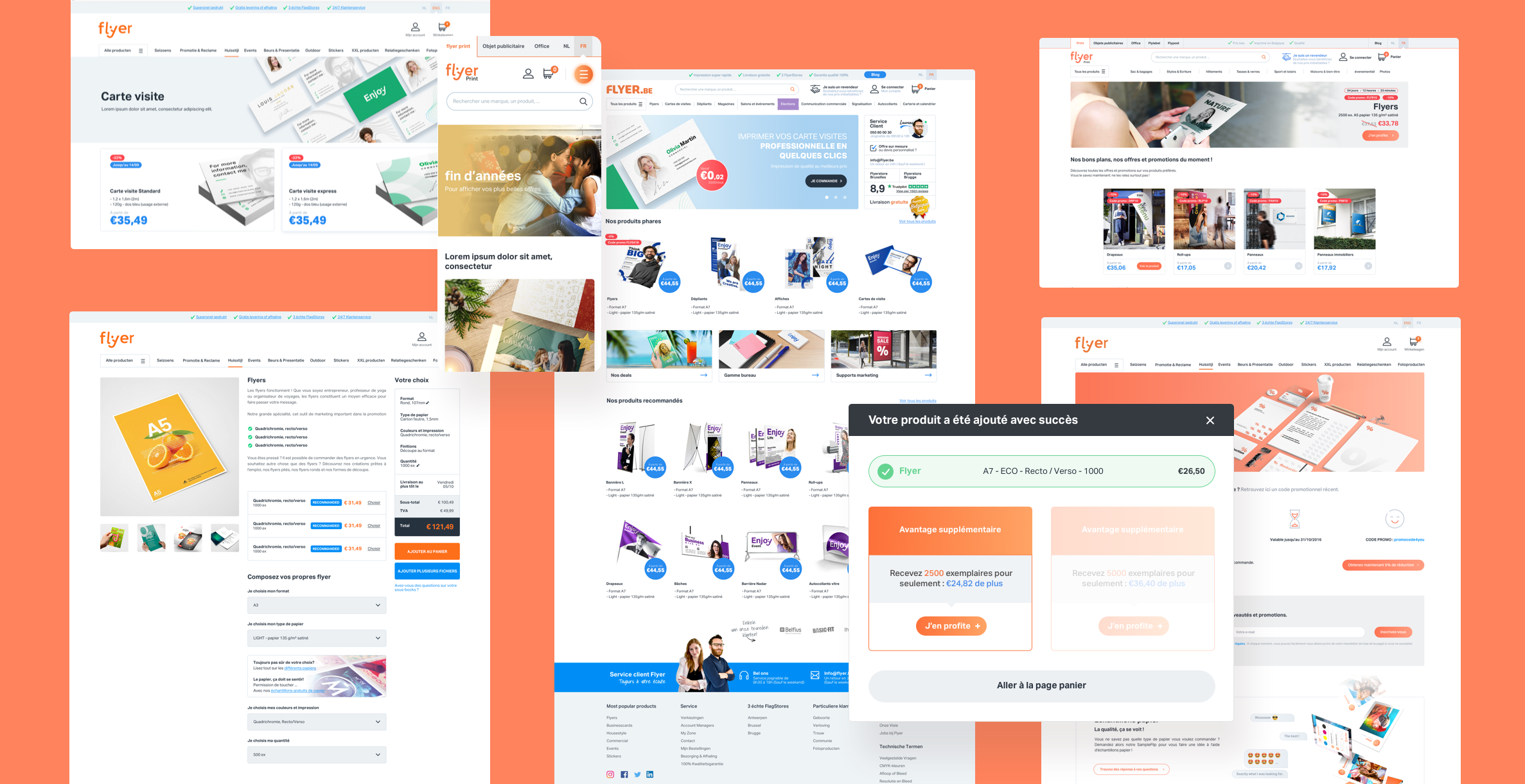
User interface
The final phase,
The use of the right colors, shapes, typography and visual elements that will be displayed to the user upon arrival on the site, Before experiencing the website, the first impression based on the appearance of flyer.be must be strong and attractive so that all the work is not spoiled.
Project Outcome
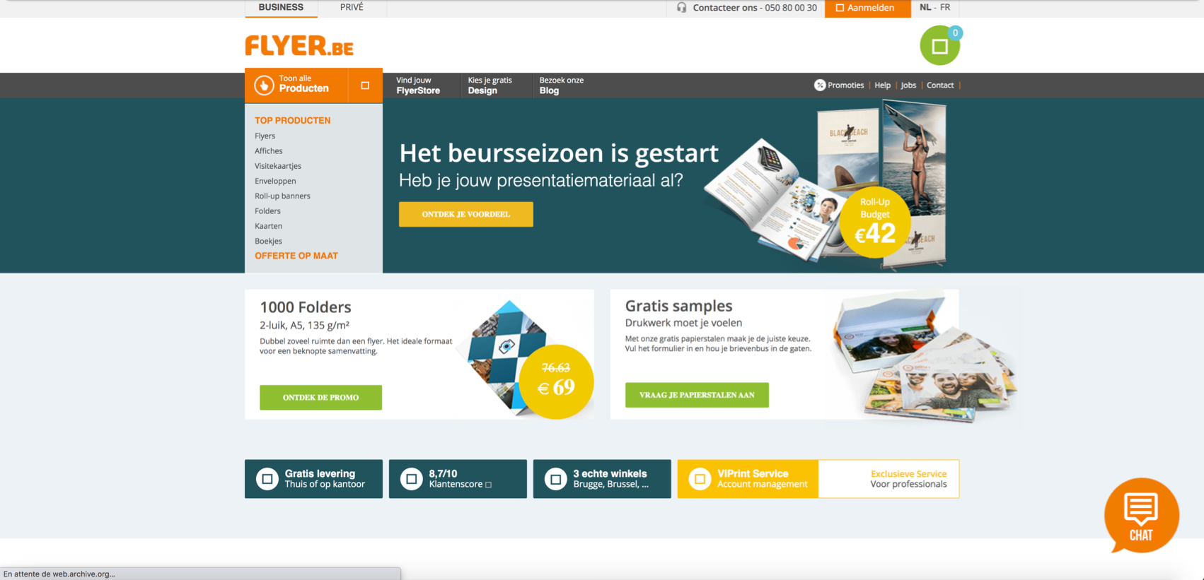
before my intervention
The website suffered from several problems, non-responsive, no visual coherence, badly organized visual hierarchy. a complicated process towards the customer’s objective, and others…
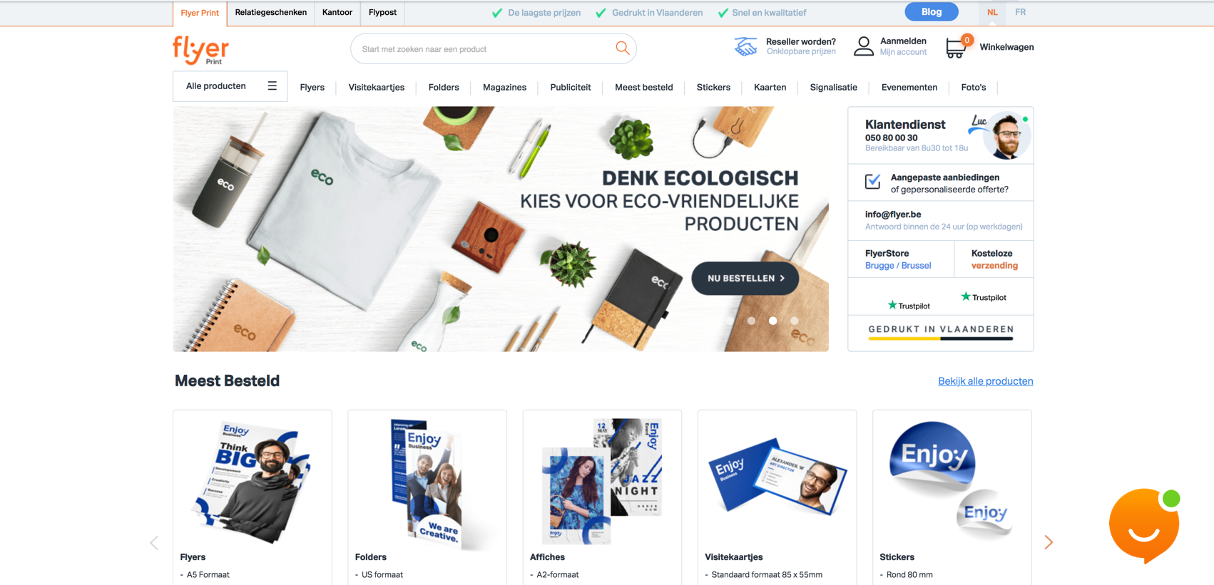
After my intervention
Improve the user experience by redesigning every page of the site, offering new features, minimizing the interface, and reorganizing the site structure so that it is easy to use and beautiful to see.
“Our website is much better, nice work has been done on the aesthetics and user experience, less customers complain than usual, which has saved us time to worry about other things.”
FounderFlyer.be
How?
know more about the process
Understand
Before starting anything, I need the basics, I needed to understand two essential elements about flyer.be :
- User
- Brand
At this stage, I have identified the problems encountered by flyer.be users and the core goal of the brand and see how they align
Research
- User/Focus groups
- Surveys
- Usability testing
Collect as much information as possible about the targeted person who will use the site, what they want to have, what they like and dislike and their pain-points etc.
The test was carried out on the old version of the site.
Analyse
Using all of the information I gathered in the previous two stages to analyze and distill the most important elements.
Analyze research:
- User personas
- User journey maps
Design
Time to build out the design.
Building things like:
- Site map
- User flow
- Wireframe
- Mockups
- Images
- Icons
- Colors
Launch
After designing and redesigning to reach a point where all my assets are ready to ship, it’s time to implement; pass everything to the development team who will create a high fidelity version of the user interface.
Analyze (again)
Once the product launches, it’s time for another round of analysis.
Instead of looking at the results of research, though, I’ll be taking a look at the overall final product.
